Last year, I started doing superficial ski reviews. I was a wannabe reviewer with zero industry testing hookups and no snow to even rent them on my own. This year, both of those things look really different. But I still like dissecting the women’s ski market.
Why? Topsheets help so many skiers who aren’t gear obsessed figure out which model they demoed or borrowed. They’re tie-breakers when you’re torn between two good options. But most importantly, I think they’re a reflection of how brands see their customers.
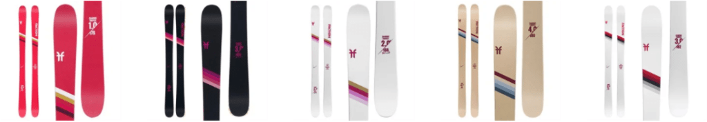
Volkl

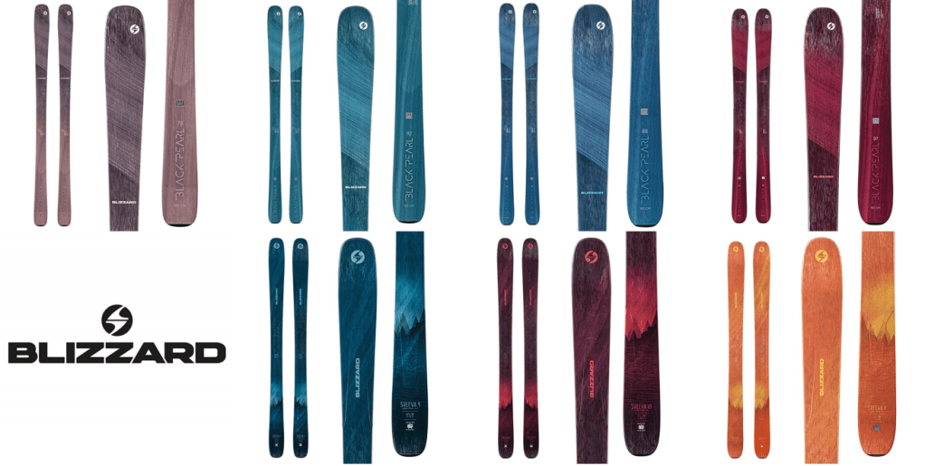
I’m really into Volkl’s varsity stripe top sheets, with color combination that nod to a feminine customer, but aren’t *too* girly, and are also pretty fresh. The icy-minty-blue of the Secret 102 is a new hue that’s everywhere this season (see exhibit A, B, C, D, E, F, G, H, I, and J), and I’ll probably complain about it next season when it doesn’t die off. But for now, I think it’s a refreshing change from Outdoorsy Girl Teal™ and Volkl’s combo with the coral is unique.
I also really like the Secret 92’s French blue topsheet. It really stands out as a unique color combo that’s palatable to a broad range of tastes.
My only gripe is that it’s duplicative of the stripes on Faction’s Candide line from 2020 that’s been carried over into 2021. There are a billion things you can put on a ski, and I’m glad they copied a good one, but I’m really disappointed when an industry that’s fueled by passion and fun can’t harness any of that into something creative to put on their graphics.
Season Eqpt

Am I featuring these because my friend’s a founder? Possibly. But I think their offerings really warrant a conversation. The skis are complete gender-agnostic, and the product pitch is that the simple black graphic keeps product from looking dated, with the hopes that skiers keep their gear longer. They also include a service package that aids in the sustainable, buy less narrative, as it keeps skis in skiable shape for longer. But it likely has some perks from a business profitability standpoint. Topsheet continuity means that egregious overstock can just be rolled into the next season, not put on deep clearance to make room for the next year’s graphic. And if you’re a brand new company with only some vague forecasting inputs, that kind of risk mitigation can make a huge difference in achieving profitability. Some brands have tried to partially roll over graphics, and the execution looks odd (like last year’s Armada Trace lineup, which got adorned with butterfly topsheets – except the 88, which carried over 2019 graphic).
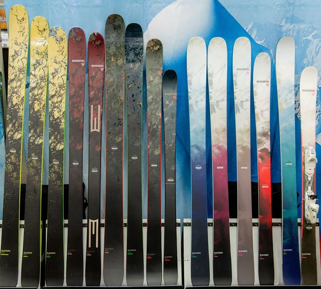
Lots of brands have been chasing a minimalist black or white topsheet – seriously, I counted 64 outside of Season’s assortment that are a uniform white, black, or dark grey. I think the commitment to execute the most extreme version of the trend makes it look like the original, even though they’re definitely not.
Salomon

The QST series is all jewel tones and mountains. Super safe, and quite repetitive (recalls last year’s Rossignol 7 series, Armada Invictus line, several years of Nordica graphics). There’s no emotion or nuance to any of their graphics.

Salomon also kicked off their Stance line this season, with two options for women. Someone must’ve read my blog last year where I wished the minimalist black & white trend carried wasn’t just a men’s- skis-only trend story. The thing is, every other brand listened too. And I think Salomon’s execution is the worst. The weird wavy and kinky lines remind me a lot of my bathroom floor after I’ve straightened my hair, where piece fall out at varying stages of the straightening process. It looks like a bad knockoff of last year’s Victa 83 or the minimalist line art on Faction’s Agent X lineup. Faction, if you’re reading this, give your art director a raise; apparently everyone’s liberally “inspired” by whatever he or she is doing.
Rossignol
I promise I’m not super critical of all brands, and I’ll rave on some faves shortly, but first I need to share how much I hate Rossignol’s new lineup. They had a ton of success with their Black Ops line, so they decided it was the next chapter after the success of their 7 series. Totally fair. HOWEVER, instead of keeping things simple and naming them Black Ops 102, 98, 94W, etc., they decide to make insanely complicated. So now the women’s line is the Black Ops Rallybird TI, Black Ops Rallybird, Black Ops Stargazer, Black Ops Blazer, and Black Ops Dreamer. “Rossignol Black Ops Rallybird TI” has 10 syllables in it. TEN! What a mouthful. If I’ve learned anything from spending my entire life going by my middle name, which is a 4 syllable double name in and of itself, is that complicated names just confuse people. And confusion doesn’t sell skis.
In intro marketing classes, you learn the law of 3 syllables when it comes to branding. That’s why New York stays “New York” and Los Angeles gets abbreviated to “LA.” All across the business world, you see these mouthful firms shortening down to their initials, like 3M, PwC, and even KFC. To make matters worse, they don’t give us any hints on how to organize the assortment. Like, by naming them, say, Black Ops Alpha, Bravo, Delta, and Echo in order of width, we’d have some context clues. Alpha, Bravo, Delta, and Echo are also letters in the military alphabet, so they don’t sound really dumb next to the name “Black Ops.” Unlike, say, Stargazer. I can’t decide if this is better or worse than that time Rossignol tried to name skis the “Savory.”
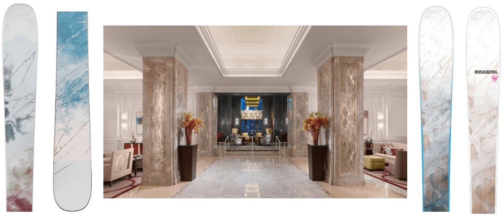
But enough about the terrible, terrible naming convention. The women’s line reminds me an awful lot of a print that would be in a late 90’s luxury hotel. One with a huge, ornate brass chandelier in the lobby over an oak table with an extravagant floral arrangement. The girls from Sex and the City have a wedding or high profile charity luncheon there. Yes I made a mood board. But tell me I’m wrong.
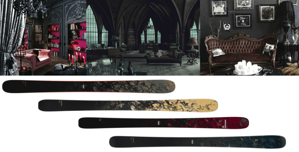
But that means we have to talk about the men’s lineup too. Because if the women’s topsheets tie back to SATC, the men’s line ties back to Buffy and Charmed. It’s the flooring of an early 2000’s gothic-inspired club that’s called something like Hell’s Kitchen. It’s in a basement, yet the designers went out of their way to make it even darker. There’s an overabundance of velvet damask, baroque frames, candles, and reupholstered Victorian furniture.
Nordica

Nordica continues to make me wonder if they’re paying Disney any royalties for their Frozen themed top sheets. This year’s color choices are slowly getting more mature and interesting with the white & grey options, but this is year 4 of Elsa inspiration, Let It Go! Let it Gooooo! I’m not a six year old anymoooore!
Line
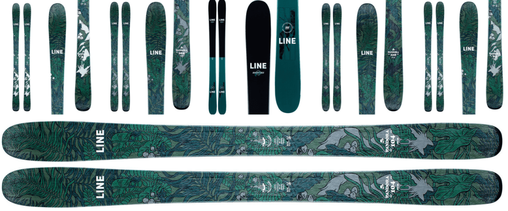
Utter perfection. House plants are having a moment right now. 5 of the 6 million new plant customers are between the ages of 18-35. They’re not super tied to gender, but the customer base skews slightly towards women. They give personality to our boxy, white apartments, help us de-stress, and help us find a community of other #UrbanJungle enthusiasts. Fucking brilliant to draw a pretty pattern of them and put them on a ski. Last year, I came up with the Bonobos rule. If you could put the graphics on a Bonobos Riviera shorts sleeve button up and see it working, it’s a winner. This pattern would be prime. There are only 2 other skis playing in this same color palette, but neither of them would be mistaken for the Pandora. Impeccable.
K2

I have to put my personal preferences aside on these because I like K2’s doing some important things right with their Mindbender graphics. First, this year’s graphics are decidedly more mind-bending than last year’s. The optical illusion graphics make a lot of sense. Second, they’ve put out the least-feminine topsheets I’ve ever seen on women’s-specific skis. It’s a refreshing move after seeing brands baby step away from pink florals and butterflies. It’ll be interesting to see whether women customers need a glittery topsheet to identify that a pair of skis is for them.

My only gripe is the Mindbender Alliance 98. The purple is so random, it doesn’t tie back to the pattern on the tails and clashes really horribly. I also wish that the interesting part of the graphics were more visible on the front half of the ski, but I understand how brand logos got the prime real estate.
Fischer

Fischer’s big story is that they got rid of their women’s line in favor a “skis for skiers, passion has no gender” message. It’s refreshing. Their previous MyRanger line was hated for the similarities to “My Little Pony,” or “My First Kitchen Set.” The professional reviews were bad, and the sales numbers were worse. The Ranger series is highly regarded on the men’s side of the aisle, so I commend them for taking the strategy of not-fucking-with-a-good-thing-unless-you-know-a-smaller-customer-segment-really-needs-something-different. They make a full size run (seriously, 150s to 190s) and offer alternative topsheets, although neither are really all that gendered. The strategy includes some fairly demanding skis, like the Ranger 99Ti and the Ranger 102 FR, and that makes me feel really *respected*. Bitches love respect.
Also, hey ski industry, please note that the feedback from men has been that the pink topsheets are dope and being able to mix and match within a pair would be even better. Some brands will make the same exact ski for men and women, and then market the men’s version as a stiffer flex for more advanced skiers. I think the Ranger’s changes prove that putting women in the same ski doesn’t cheapen it’s stock with advanced, aggressive male customers.
Faction

I gave Faction a lot of credit last year for launching the same strategy that Fischer’s testing with a single line and alternative topsheets. This year, they’ve expanded the options for their “X” series topsheets, and touted the same “skis for skiers” marketing message, yet in the product stats, there are variations between the unisex and women’s versions. There are lots of things I hate about the women’s side of the ski market, but the amount of inconsistent and incomplete information is by far the worst part.
In terms of topsheets, some skew a little juvenile, but they’re mostly trend-forward from a color perspective and touches are nice. The art Agent and Prodigy line feel emotive, intellectual, and inspired (especially compared to the stray-hair graphics on the Stance). Without any art, the Easter egg Dictator series feels too young,
Coalition Snow

Coalition skis never fail to disappoint since they’re all grown women who know what grown women like, and they don’t have to compromise with anyone who’s not a grown about what grown women are looking for.
This year’s lineup is no exception, with illustrations from Folklaur Studio and a guest feature by Brooklyn Bell, an athlete + artist + diversity advocate from Washington. It’s nice to see a brand provide more opportunities to minority skiers than just a “We’re listening and learning” Instagram post.
The thing I love most about this year’s lineup is that there’s a unifying theme with moon graphics, which unites the unique aesthetic each ski has. If there’s one thing Millennials are loving just as much as houseplants, it’s astrology. I think the outlook is pretty sunny for these moon-themed sticks.
Blizzard
Somehow these graphics are brand new, yet also the exact same as last year. The Sheeva line is also the exact same jewel-tones-and-mountain-graphic from Salomon. I still hate the men’s-bull, women’s-feather graphics that they love so much, and I still think the Cochise line is cultural appropriation and really tacky to send White people onto public lands violently seized from Native Americans. People reason that it’s named for Cochise the bull, but who do you think he was named after? Likewise, that doesn’t explain why they also launched the Dakota and Cheyenne in similar timing.
Atomic
They’re all grey and boring, so I’m not going to even bother adding their pictures. I repeat again, Atomic, if you’re reading this, let Chris work his magic on a women’s ski and I’ll pay whatever you want for it.
Armada

Armada again serves us with a trio of ski lines, and they remind me how much I appreciate animal-inspired graphics. The Trace line iterates on the butterfly-but-for-adults graphics they debuted last year. They make for a super cohesive brand story when you consider the skis are designed for touring and are known for being light and maneuverable. The only thing that I don’t get is that there are coordinates written on all 3 topsheets, one for Mauna Loa, and the others for random spots near the Ivory Coast and Newfoundland. For the men’s, they’re glacier coordinates on a glacial topsheet. But I can’t figure out what they have to do with butterflies for the Traces.
The ARW series has a playful set of pixelated animals that remind me of my favorite animal topsheets on the Line Pandora in the early 2010s. And the Victa’s make a return to the “badass sci fi female lead” aesthetic that took a year off last year.

Woah. This is incredible. Thank you so much. Love the insight!
LikeLike