My first ski reviews were shit posts about topsheets. I owned a single pair of skis and had only ridden a handful of others at industry demo days. But I wanted to get into ski reviewing and needed some sort of content to start with to build a portfolio and a following. So I talked about what they looked like. That piece made its way over to the folks at Coalition Snow, who shared it with their fans and followers. 500 readers – which felt huge at the time – dropped in to hear my thoughts about ski art. Over the years, I’ve transitioned into “real” ski reviews, readers still want to read about graphics. They also wanted to share their thoughts too, with dozens of hot takes in my DMs. I realized that this conversation could scale, so this year I put them to a poll.
So I put every major line of women’s skis on their own Instagram poll to Toot and Boot. (Tooting and Booting comes from a Drag Race recap series run by two drag queens. Shoutout to the LGBTQ+ community for endless great cultural references).
Skis were presented by line (or all women’s skis for brands with smaller lines). Then I separated out men’s votes. They tend to agree on skis they really like, but they had very different opinions on the least-liked side of the scale and swayed the results in the data. Coding responses from men was less than scientific. Some had pronouns in their bio. I know some of them personally. But a lot of it was assumptions that bearded folks named Zach or Brian with no pronouns or flags in their bios were generally fine with being perceived as men.
I also note that the remaining group is marked as “sans men” instead of “women.” There are non-binary respondents. There are votes from very private, anonymous accounts with no suggestion of the user’s gender. There are a few brands and outfitters that participated. Could I have asked only women to respond? Sure. But no other outlet offers a chance for men to share their thoughts on graphics. It’s fun for everyone. And it wasn’t too much trouble to filter out male voices that already get represented and heard by the industry.
From there, I hit sort on the data and crowned our winner, our loser, and noted some trends. Full data is at the end of the piece.
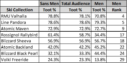
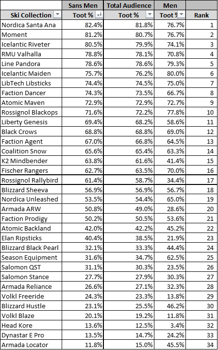
Nordica’s Santa Ana line was our most tooted topsheet for 2023 with an 82.4% approval rate once men’s votes were factored out. This makes it a second-year reign of sorts. Last year I did a much smaller poll with around 10 product lines and no back-end data validation, and the Santa Ana took that crown as well. For the second year, I was surprised at first. It’s not a very interesting graphic. But the question was whether or not the audience liked a topsheet, not which ones were their favorites. Would anyone say the Santa Ana has the best topsheet? Or top 5? In my opinion, probably not. Instead, Nordica makes a lineup that’s fairly unobjectionable. It’s not plain, but the graphics aren’t overwhelming. There’s color, but none are overly bright, nor overly gendered. It’s a safe design, but feels like a fresh alternative to the endless blue swirls that brands have relied on for the past ~15 years.
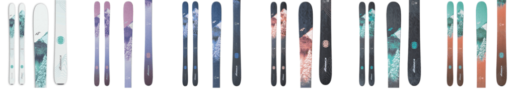
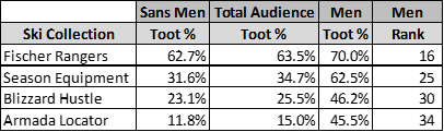
Armada’s Locator series came in dead last with an 11.8% approval rate after men’s votes were factored out. They’re a little plain for North American tastes. The art renderings strip out the little contrast and visual interest that they do have. But I think the biggest issue for women is the color choice. In boots and skis, the primary, “Crayola” colors have traditionally been used for men’s product. Women’s products use more jewel tones, pastels, and (when trendy) neons. Armada made a unisex ski line, but inadvertently pushed it to men by aligning with decades of color coding. In 2024, they’re adding a pastel topsheet alternative to the 88, 96, and 104. In one-on-one consultations, women have had very little interests in the Locator and I wonder if a graphic change is enough to convince them that Armada had skiers like them in mind during the R&D process for the ski.
Put a mountain on it. Art can be polarizing, but most skiers are big fans of cold, snowy mountains. In line with the rest of Nordica’s choices for the Santa Ana, it’s a choice that added visual interest in a largely palatable way. The Icelantic Riveter (ranked 3rd of 34 lines; 80.5% approved) featured snowy mountains. A similar graphic was highly rated last year. The LibTech Libsticks (14th, 74.4% approved) and Rossignol BlackOps (10th, 71.6% approved) also used mountain art for all or most of their lines.

Women don’t like unisex graphics, especially when there’s only one option. Unisex skis were some of the least liked topsheets. Alongside the Locator (34th of 30, 11.8% approved), the Blizzard Hustle (30th, 23.1% approved) and Season Equipment (25th, 31.6% approved) didn’t resonate with women. They also all performed much better with a men’s audience.
The Fischer Ranger, which offers two unisex topsheet options, fared much better. Both colors cover the whole size run. Most skis offer one drab color and one vivid, with the exception of the Ranger 90, which comes in “grey” or “cement.” This also seems to be a compromise between North American and European tastes.
Still, all of these lines fall short of brands like Faction and Black Crows that openly state that both skis are the exact same, but break them into traditionally gendered size runs with 2 different topsheets.

Fashion’s retro tastes carry into topsheet preferences. Current apparel design trends are borrowing heavily from 1970s and Y2K aesthetics. The Line Pandora (5th out of 34, 78.6% approved) calls back to Y2K graphic design trends. The Faction Dancers (8th, 74.3% approved) has a 1970s, Studio 54 sort of design. And those Libsticks reference both decades. The patterns used for the sky, sea, and flowers all reference 70s design, but the overall designs are very “2000s surfer” that would pair well with the signature puka shell necklace.

We like artistry in our graphics. Graphic design can range from artistic to commercial, and we tend to favor the former. Brands who name and celebrate their artists also tend to be highly ranked:


Swirls for the Girls. After the 2020 Pandoras came out with their teal, swirly topsheets, I made this graphic to emphasize how overused and tired those design elements looked in ski design. This year’s data proves that those traditional, round, single color swirls are dead. The Black Pearls, Backlands, and Volkl freeride lineup (Yumi, Kenja, Secrets) made up some of the least popular women’s graphics.
But brands that evolved their abstract graphics saw a lot of success. The Atomic Mavens gave the traditional swirls some unique color combinations. The Rossignol Rallybirds and RMU Valhallas gave their abstract designs a watercolor shape and effect. It doesn’t take a ton of effort to avoid looking like a corporate desktop background.
And lastly, the full data set. Feel free to reach out by email or the comments with any additional questions on the data and methodology. And to follow along with Femignarly, subscribe with the link below or follow along on Instagram.
