Every year, I review topsheets. Are they an important aspect of a ski’s construction and performance? Absolutely not. But they mean a lot to me. I’ve worked in marketing and branding, and I know how design work focuses deeply on who the customer is and what the customer likes. It gives me a good sense of what each brand thinks of women, or if they think of us at all.
When I mention how I care about topsheet graphics, I get a lot of comments, particularly from men, as if I’m the new skier who buys exclusively on looks. (I mean, I did say that I bought the Backlands despite the graphics). And they never seem to keep the same energy when guys froth over the latest Bent Chetler drop. I’ve written a fair bit on how the industry favors masculinity, and women seem to take a hit to their perceived ability if they care about appearances of their gear. It mirrors life off the ski hill and how wearing fashionable clothing makes women seem more intelligent, but the pursuit of fashion in-and-of-itself is a superficial and frivolous pastime.
To me, graphics are an important tool where the brand can tell us how they view women in snowsports, show how they perceive gender, and give us some insights to what’s under the hood for each particular model. With that, here are a few trends that we’ve seen in women’s topsheets, as well as the industry at a whole.
- Women-centric design industries write countless pieces on trends, but a huge number of brands don’t care to find out women’s current tastes and instead go for something easy. There are 2 lazy trends that brands use for women’s skis: swirls and mountains. Use some jewel tones or pastels that would never be used on men’s skis and call it done.
- Some brands also like to use colors and motifs that are constants in the young girls’ toy aisle when it comes to graphics and topsheets. Infantilization of women is a major issue across all sports (calling women athletes “girls,” referring to men by their last names but women by their first, emphasis on camaraderie over competitiveness). And it’s used to reinforce imbalances of power and importance. Women on the receiving end of infantilizing behavior tend to show lower confidence and more feelings of vulnerability, which aren’t helpful traits on the mountain. It’s not to say that women shouldn’t like Barbie pink or can’t rip clicked into teal or purple skis. But it’s more to question manufacturers who go for those colors across their entire lineup, season after season, and don’t see how that’s problematic.
- We’re shifting out of minimalism. Just like the all-white kitchens, grey wall paint, and minimalist grey and black athleisurewear, minimalism is going out of style in skis. In the late 2010s to 2020, we saw a number of skis (especially in men’s) go for an all-white or blacked-out topsheet with the contrast print in a clean, simple sans-serif font. Any graphics were also minimalist, geometric, and black-and-white. (See the 2019 Bent Chetler or OG 2020 Line Visions). These trends are out.
- In more youthful brands, we’re slowly shifting into a Y2K millennium throwback aesthetic. Graphics are getting bright and busy. Imagine Ed Hardy, MTV Next Bus, and the Backstreet Boys, but as ski graphics. The 2000s were also the golden age of wild-looking park skis. Armada and Line were either founded or became major brands, and mainstream brands like K2 had several lines of edgy looking Seths. We’re mainly seeing a lot of this 2000s nostalgia on the men’s side of the business. The K2 Reckoner, K2 Mindbender, Volkl Revolt, and Line Sick Days are all playing with this trend, but K2 is the only one bringing the same concepts to the women’s side of the aisle. Below, the OG Y2K graphics on top, and the resurgence underneath:

- On the more “grown up” or “sophisticated” side of the business, I think we’re going to see trends that mirror interior design and the “Modern Organic” trend. I think we’ll see more woodgrain prints or exposed wood, warm colors like rust and gold, and lush greens. These are starting to show up on the men’s side of the aisle, but only a few brands are implementing it for women.

With that, let’s get into the brands
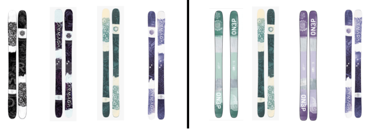
Armada

Running Total, Mountains: 0
Running Total, Swirls: 4
Armada usually has really awesome women’s topsheets that are either the highest execution of a trend or so unique that they stand apart from anything in recent trend cycles. The Traces nod to the Organic Modern trend with some subtle southwestern graphics, but the geometric shapes on the new Reliance series are boring and lifeless. The marbleized swirls on the ARWs are fine, but they seem like a cheap knockoff of the 2019 Pandoras. This isn’t the first time it felt like Armada was copying another brands’ work. In 2020, their ARW line looked awfully close to the prior year’s ON3P Jessie. Pretty underwhelming when you consider how unique their men’s line is.
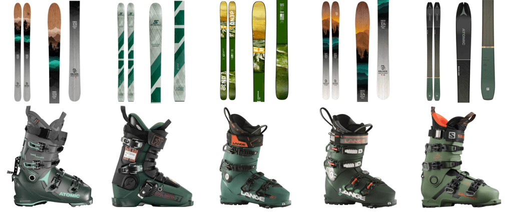
Atomic

Running Total, Mountains: 0
Running Total, Swirls: 7
Somehow these are both boring but ugly and infantilizing all at the same time. But if they’re going to channel any pop culture from young girlhood, I’m glad that they went with Powerpuff Girls.
Coalition Snow
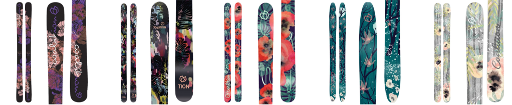
Running Total, Mountains: 0
Running Total, Swirls: 7
I love that Coalition always has a common theme, but each ski gets their own unique look. Last season, it was moons, which I really loved since a lot of women love a good astrology reading. But this year is flowers, and like, “flowers for skis? Groundbreaking.” But they do look really nice. The SOS resurrected a topsheet that was a customer favorite, and the La Nieve is absolutely breathtaking. My only ask is that birds, bugs, and cats make it into the rotation for themes (if you look closely, the grey Rafiki has leopards, and an old Abyss had beautiful peacock plumes).
And while I’m out here making absurd demands, I’d also like to blow out the Skida collab beyond 1 print per year. And I’d also like to make a motion to put all these prints on a some underwear and a silky chemise and a notch collar, button down pajama set. Imagine a little bachelorette getaway or ski-vorce party where everyone gets matching Coalition loungewear.
I’m glad Coalition does accessory pieces because I don’t buy new skis every year, but I do wanna microdose on rad, women-led energy and gorgeous prints every season.
Elan

Running Total, Mountains: 0
Running Total, Swirls: 7
Eh, fine. European brands will never be the zaniest when it comes to graphics. There’s a lot of pink, but it doesn’t come across super juvenile.
Faction
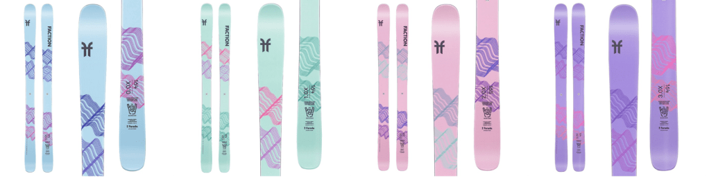
Running Total, Mountains: 3 (Agent series, 3 skis, carry over from LY)
Running Total, Swirls: 7
Faction’s one of those brands that did some bright, Easter egg-y topsheets last season that just seemed like part of the rotation through beautiful and interesting graphic concepts. But they’re sticking with the theme for a second season, and I’m starting to worry that they’re sticking with the soft, sweet, precious, delicate pastels because that’s how they view us. I can deal with a dash of girly styling every once and a while, in moderation, and especially when the artwork is striking (like last season’s Prodigy line).
That’s not the case for this year’s Prodigies.
Worse, they look like re-colored versions of the Salomon Stance, and all of them look like my bathroom floor after flat ironing my hair and strands fall out at various points in the straightening process.
Icelantic

Running Total, Mountains: 6
Running Total, Swirls: 7
Icelantic always stands out for their unique topsheets, and I really like that they do a theme and an explanation of the artwork for each series. The Riveter series went with the quick and easy “Put a Mountain on it” strategy. The Maidens are dedicated to ancient cultures, with Egyptian, Greek, and Japanese themed graphics. As a white woman, I’d feel a little uncomfortable owning the Egyptian and Japanese graphics. I don’t know if it’s problematic or any of the graphics are a gross misrepresentation of those cultures, so I’d probably err on the side of caution and buy a different ski or wait for a new season of topsheets.
The Mystics, however, are my favorite. Each season, they do some sort of mystical character. The past two seasons have featured a Pegasus and a mermaid (my personal fave). They’ve got a Jackalope on them for this season, and I just think the entire theme makes for a really strong brand message.
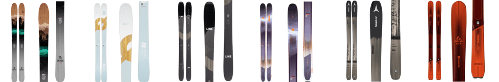
K2

Running Total, Mountains: 6
Running Total, Swirls: 7
K2 continues the optical illusion-y graphics on the Mindbender series. Like years past, they depart from gender norms when it comes to their color choice. And as brands are playing with the Y2K resurgence in fashion and design, K2 is one of the only brands serving those trends up to women. They also offer up the K2 Midgnight (which is the old MissConduct, but with a less sexist name) in a standard and special edition top sheet. The inverted stripe pattern on the special edition is really striking to me. And they round out their assortment with the K2 Reckoner Alliance, which also has a new millennium, Ed Hardy vibe, and the roses and thorns match back cleverly to the barbed wire pattern on the men’s version.
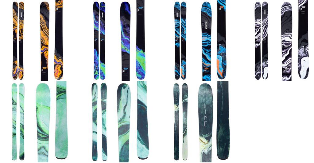
LibTech

Running Total, Mountains: 6
Running Total, Swirls: 9
Meh. At least it’s better than the name “LibSticks.” Elan already did a lipstick play on words with the Ripstick. And they also used the name across men’s and women’s skis so it has less of the “get it? We call it a LibStick because lipstick’s for girls” sorta vibes
Liberty
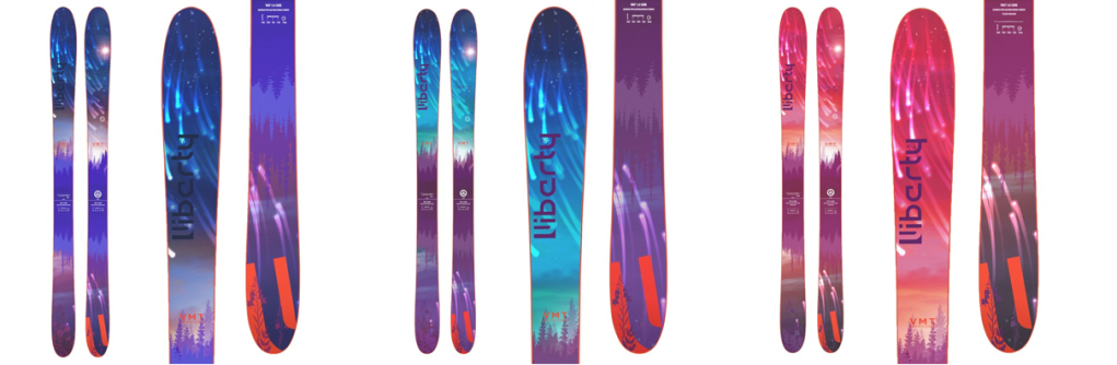
Running Total, Mountains: 6
Running Total, Swirls: 9
At first glance, I thought we had mountains and swirls with these graphics, but upon closer inspection, just shooting stars and pines. These topsheets remind me of my 1996 Christmas list, when I was obsessed with Hot Skatin’ Barbie and Hot Skatin’ Midge – identical color schemes. Now, I do appreciate that Liberty went different color schemes for the past 2 seasons, and bright colors nostalgic of childhood are fun sometimes, but I hope that don’t get back into the habit of serving them up every season. Our tastes have changed since preschool.
Line
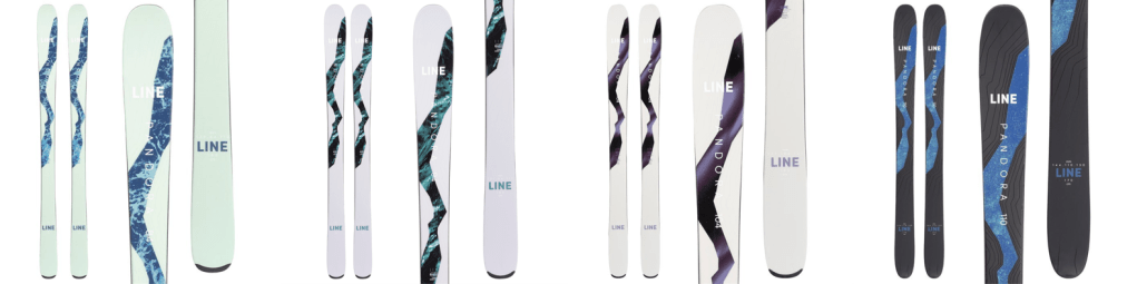
Running Total, Mountains: 6
Running Total, Swirls: 13
How is this the same brand that gave us those beautiful botanicals from last year?! I don’t think it’s a coincidence that last season’s Pandoras were largely sold out by mid-winter, while the line is still fully stocked this time around. The Pandora’s had some of the most striking designs since the original 115-wide Pandora powder ski hit the market. I expect more from them. At the very least, I’m glad the 110 is a unique color now. It’s a completely different ski (modeled on the Vision 108, not the men’s Sick Day series like the narrower models). I appreciate that there are some visual clues with the color change.
Moment

Running Total, Mountains: 6
Running Total, Swirls: 13
Best topsheets of the bunch. The florals are pretty. The Sierra has a fucking ASTRONAUT on it. Fd me another ski with an astronaut, much less another women’s ski. The Bella Tour is my favorite. I fucking LOVE an animal motif on ski gear. The OG Pandora went through an octopus and birds and a peacock and fish. But I especially love origami-inspired geometric animals. (Now that I think about it, the Bella Tour definitely matches the Femignarly logo and my favorite pair of black and gold fox earrings).
Nordica

Running Total, Mountains: 11
Running Total, Swirls: 13
The Santa Ana line gets increasingly boring every year, but given where it started, that’s not necessarily a bad thing (exhibit A – Barbie graphics, exhibit B – Elsa graphics).
Salomon

Running Total, Mountains: 15
Running Total, Swirls: 13
Salomon finally made a minimalist grey topsheet for women two seasons after it went out of style.
Volkl

Running Total, Mountains: 15
Running Total, Swirls: 20
Oh, this is awkward. Volkl and their biggest rival, Blizzard both showed up for the season wearing the same outfit. Readers, what do you think? Who wore it best?

