I don’t have quite the time or money (or snow yet – wahhhh) to really put all the skis on my radar through the paces, but in the meantime, I’m serving up reviews of the 2020 women’s topsheets and graphics. But first, while I hope this goes without saying , here’s a quick reminder that you should ultimately choose skis that are a good fit for your style and ability level. Sweet graphics should just be icing on the cake.
Armada – Starting with the ARW series, I don’t really have anything to say other than that they’re a total knockoff of the ON3P Jessies. Especially from the Year of the Doilies. If you’re going to steal one of their graphics, for the love of all things holy, bring back the snakes – arguably the best women’s ski graphics of all time.

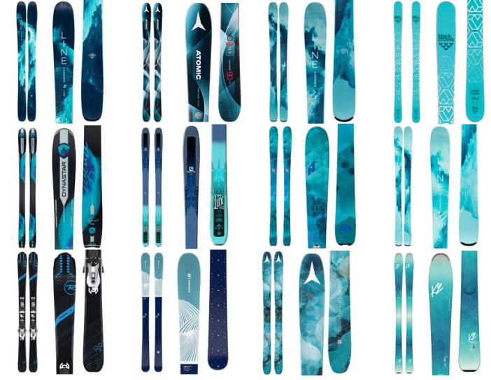
Within the Victa series, they’re… fine. The men’s side of the ski shop has seen a really crisp black & white trend in top sheets, and it’s cool to see something similar on the women’s side. The pink and teal are a little lackluster, and at quick glance could easily be mistaken for a 2017 Salomon Lumen and Stella. It’s disappointing since the Victa series has had an aesthetic akin to a female action thriller heroine – Milla Jovovich from Resident Evil, Katniss Everdeen, Buttercup from the Powerpuff Girls kind of vibes – sleek, cunning, tough, a little bit angry, shakes some gender norms. And at least for the Victa 97Ti, they skied how they looked. It’s disappointing to see them start to morph into something cookie cutter that blends in with all the other skis on the wall.

The Traces, on the other hand, look fantastic. Their graphics are zoomed-in shots of butterfly wings, an appropriate nod to their light weight, uphill efficiency, and maneuverability, but in a package that looks more mature and sophisticated to the old butterflied Head Sweet Fat Thangs. There’s also matching outerwear and baselayers and I want to buy them allllll.

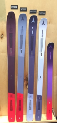
Atomic – I guess it’s an improvement on last year’s purple and red lineup that looked like a Red Hat Society commemorative lineup. Otherwise, I’m still mourning the old Century and Elysian and the 2018 lady Backlands.
Black Crows – One of the rare instances where the women’s line up looks better than the men’s, which looks a little “Beetlejuice! Beetlejuice! Beetlejuice!” I just wish they were a little more progressive in their color choices. They’ve single-handedly filled the backcountry with men on hot pink skis; is it really that farfetched to imagine women wanting something other than pink and teal?

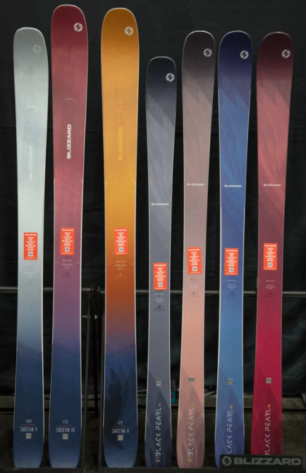
Blizzard – Y’all, this feather. A little backstory: the feathers first appeared on the 2015 and 2016 Black Pearls & Sheevas as a part of a dreamcatcher graphic. Then, I imagine (or at least hope) that someone was like “hey, most ski resorts exist on Native lands that they were forcefully and violently removed from, so filling the slopes with white girls on skis covered with Native imagery might not be the best move. Also, putting a dreamcatcher on a ski named ‘Sheeva’ kind of suggests you’ve got exceptionally poor knowledge of brown people and their cultures.” So in 2017, the women’s line got feathered. Now, all women’s skis feature feathers and all men’s skis feature a bull. Get it? Women and their skis are soft and light, and men and their equipment are (thick Eastern European accent) strong, like ox. (But let’s be real, the Bushwacker and original-construction Rustler 10 are definitely more feather than bull.) This year’s feathers are sharper, they’ve dropped the glitter, and they’ve gone with a less hyper-feminine color palette, but I think the bull vs. feather is still a problem. It’s not just the eyeroll-worthy gender norms, but also it doesn’t do many of their skis justice. Blizzard really has things dialed in terms of creating tools for progression. They serve the ballsy intermediate incredibly well, with skis that are fairly easy to ski, but also maintain composure as she develops into a faster, more aggressive skier. I don’t think the feather tells that story accurately. The same goes for the men’s side where skis like the Rustlers aren’t bulls in a China shop, and many consumers are glad they aren’t. (Also, Blizzard, if you’re reading this: it’s also time to retire the Cochise for cringey Native appropriation reasons.)
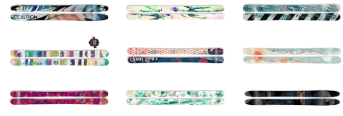
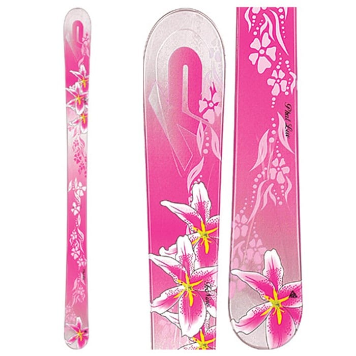
Coalition Snow – Coalition really proves that you can put flowers on a ski and sell it to serious skiers. You can paint them pink and sell it to female customers who are exasperated with skiing gender norms. Tip #1 – don’t make it your entire assortment. Tip #2 – Use the Bonobos test. If you could sell it to artsy dudes on a Bonobos Riviera short sleeve button up, it works. These pass the test. These don’t. If you really want to lose your female shoppers, infantilize her.
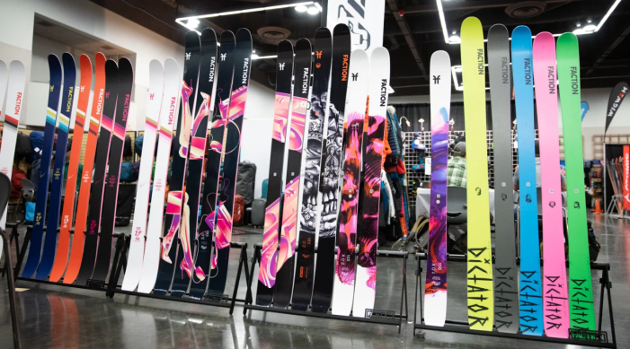
Faction – Faction made a bold move last year and consolidated their women and junior line into their men’s offerings. Most skis run from the 150s to high 180s and get softer for smaller sizes. Shorter lengths have 2 topsheet options: the unisex one or a slightly more feminine one. And I can’t stress the term *slightly* enough. None of topsheets are particularly gendered, and the men’s side features a lot of pink this year. The only downside is that you can get so torn between the CT 2.0 and 2.0x that you ultimately end up buying neither.
K2 – K2 wins most improved this year. Goodbye to a line that shared a name with a diaper brand. Goodbye off-piste exploration tool for advancing skiers being named the “FulLuvIt.” Goodbye Limited Too inspired graphics. Goodbye to the notion that women’s gear should have bratty and immature misspellings. That line can burn in hell. The Mindbender line is a touch boring. Brands seem to reserve all the cool, dynamic color options for men’s gear and give women whatever’s leftover. Instead of the fruity hues from my middle school wardrobe, they gave us all the drab ones, and put justttt enough glitter on the tips so we know who it’s made for. Kudos for clearing an incredibly low bar.

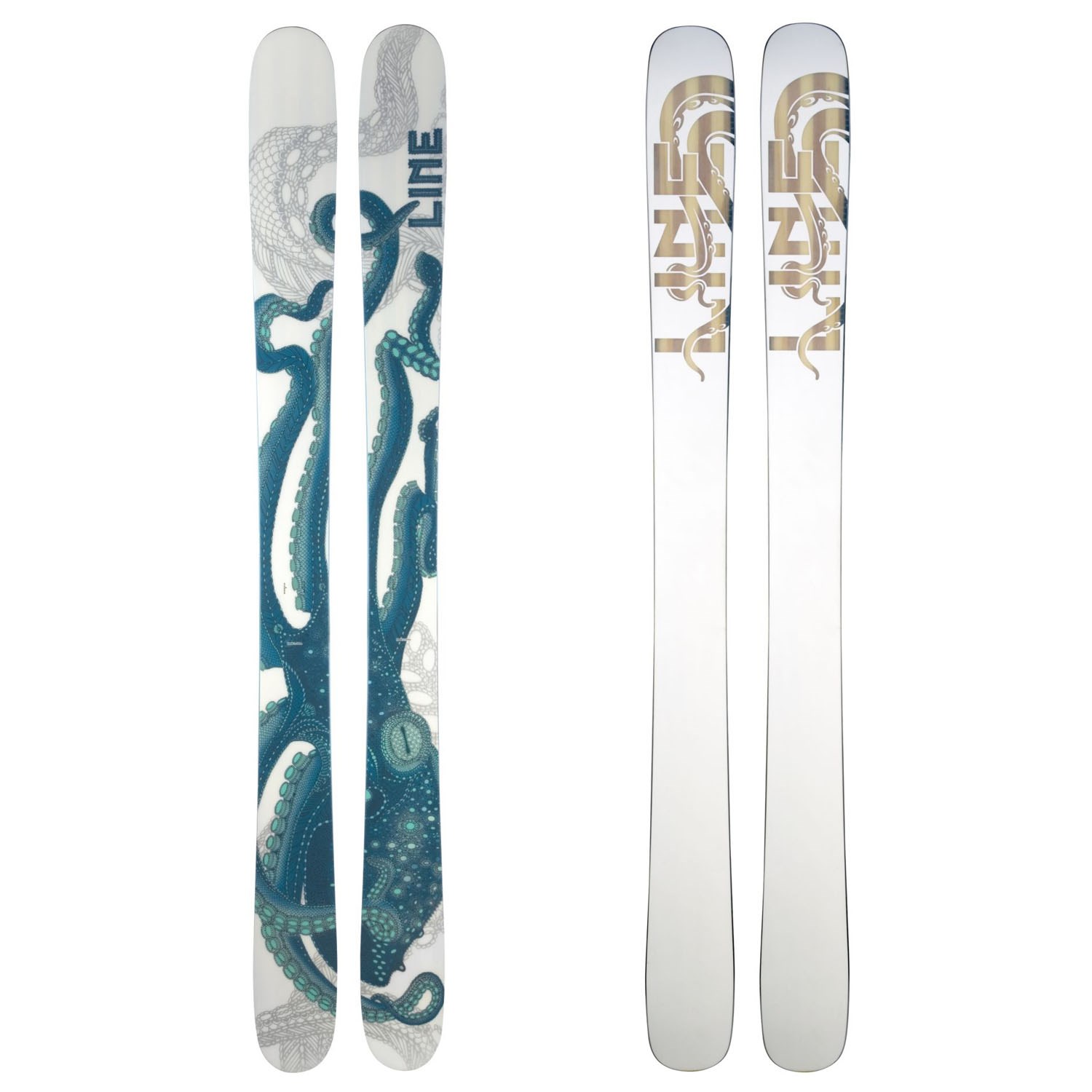
Line – Let’s talk Pandoras. First, the name. Some people find the legend of Pandora misogynistic, I don’t mind it. (If you haven’t brushed up on your Greek mythology, Pandora’s character is like Eve, except that instead of being a dumb bitch with no willpower, Pandora releases all the evils of humanity because Zeus made her devious and curious as part of a plan to get back at the humans after some drama over fire. At least homegirl has some agency in the story.)
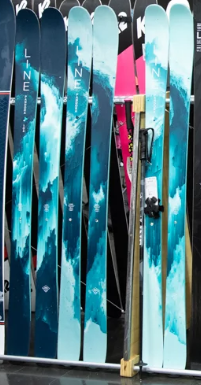
For the looks department, they’re fine, but forgettable. And that would be fine for most brands, but Line consistently churns out unique, interesting graphics (see: the Octopus Pandoras, Paint Splatter with white-on-wood bases Pandoras, last year’s metamorphic rock lineup), and this year, all they deliver is cheese pizza.
Nordica – Nordica is that relative who gave you American Girl doll merch well into your teen years because they don’t realize that female tastes change with age.
Rossignol – Someone explain to me how the most boring skis on the wall ended up with names like “Soul” or “Spicy.” And we’re still serving some side-eye over the Sassy7.

Volkl – As if some bold/odd/interesting color combinations weren’t enough, most of these skis also feature several different animal prints to boot. These remind me What Not to Wear episodes where Clinton and Stacy would put the nominee in the 360 degree mirror and say something like “you’ve got so much going on with this style that we almost start to lose you.” The ones that are more heavily black & grey aren’t so bad, but they don’t hold a candle to the black & geo combos from the mid-2010s that screamed feminine badassery.

